The Artist’s Problem Solver

SISTERS IN THE SANDS
pastel on paper, 46 × 66 cm (18 × 26 in)
This painting is composed of horizontal bands of colour, and the foreground area between the base of the picture and the focal point of the three children was quite deep and so potentially tricky – it could have been rather bland and boring. However, I emphasized the undulations in the sand, and the areas of blue, to break up the foreground in a lively and interesting way. Marks in the foreground are much larger than those in the distance, too, helping the sense of depth.
A thumbnail sketch will sharpen your perception; you begin to see the subject through a painter’s eyes and in pictorial terms. Clarifying your mind, and attempting to create a well-balanced design, does not mean that the image is set in stone – it simply means that you will be able to work more freely with your chosen medium, concentrating on the creation of an image that is a combination of good design and painterly approach.
KEEP IT SIMPLE
A very useful way to think about how to tackle areas of foreground is to consider the way we ‘see’ a scene at first glance. When we look at an area of landscape our attention usually focuses on a main point of interest – that which attracts us most. We are aware of the foreground – the area between our feet, and this point of interest – but only peripherally. So, somehow, we have to find a subtle way of painting the foreground so that it leads us to the point of interest, but does not detract from it.
A particularly useful aide-mémoire, therefore, is KIS – Keep It Simple. The danger, when sitting in front of a subject, is that we look too hard, and long, at the foreground, because of its proximity.

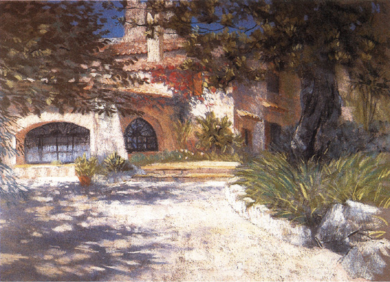
THE OLD MILL HOUSE, MAJORCA
pastel on board, 46 × 66 cm (18 × 26 in)
The foreground in this instance was an area of fairly colourless gravel – but once again, the sunlight came to my aid, and presented me with some wonderful shadows to use. Cover the shadows with a finger to see how important they are. Without them, the foreground would have been a large, featureless, uninteresting shape at the base of the picture.
Areas of foliage, for instance, can be very complex indeed, and if they are portrayed very precisely they will hold the eye firmly in the foreground, preventing any movement ‘back’ into the scene. It is generally a good idea to keep most foregrounds fairly simple – which may mean forcing yourself to find a way of simplifying what you see. Squinting at the scene often helps. Having said this, there is another trap waiting for the unwary painter. If you make the foreground too simple it might look empty and monotonous. A painter’s life is not easy!
A FEW DOS AND DON’TS
If your area of foreground is a large expanse of ground – for instance a field, or an area of grass, or sandy beach – while Keeping It Simple, DO see if you can vary the colours, and perhaps the tones, for variety and interest.
In order to encourage a feeling of recession in the image DO see whether you can use larger brush or pastel marks in the foreground, and allow your marks to become smaller and finer as the scene recedes. This will create a good illusion of moving from foreground, to middle ground, to distance.
DON’T block the viewer’s ‘path’ back into the picture with a monotonous horizontal foreground feature, such as a fence, a wall, or a line of tall grasses across the bottom of the picture like a fringe.
Obvious ‘linear’ landscape features such as paths, rivers or furrows can be used to lead the viewer’s eye to the main point of interest, but DON’T FORGET that you can deliberately use shadows on the ground, subtle modulations of colour and tone, and suggestions of texture, for the same purpose.
DON’T simplify the foreground to such an extent that it becomes a featureless bland shape at the base of the picture.
Where possible, DO see if you can create subtle ‘zig-zags’ back into the distance – diagonal movements towards the background move the viewer gently backwards, encouraging a look around along the way!

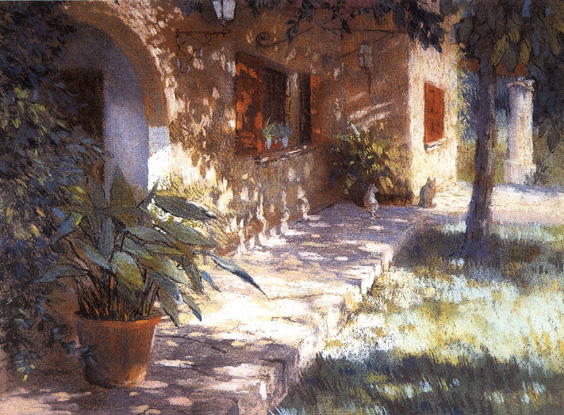
GARDEN SHADOWS, C’AN GAURI
pastel on board, 46 × 66 cm (18 × 26 in)
In this picture the eye is led towards the background, despite the important foreground element of a large potted plant on the left. The reason that the plant does not hold the viewer in the foreground is that the ground shadows link with the plant. The close tones in this foreground area hold together well, allowing the eye to move back gently, not only via the linear element of the path, but also across the bands of light and shade, which diminish gradually in size.
Try to think of your foreground as a challenge – the challenge is to make the foreground an interesting and useful area, without necessarily including every element of detail visible in nature. You are an artist, not a photographer, so you can edit the foreground, and impose your will, and creativity, on the scene.
Pictures speak louder than words, so have a look at some of my paintings reproduced on these pages. Although I seldom tackle traditional landscapes with obvious foreground, middle and distance, I have included a few images that demonstrate the principles I have discussed here. Notice particularly how light and shadows can often provide strong directional elements to help your compositions.
6
FLORAL STILL LIFES
The flowers in my still lifes seem to lack life. How can I make them look really lush and thriving?
Answered by: John Lidzey
Flowers in a still-life setting can present the painter with an exciting prospect. They can offer a range of beautiful, delicate colours and tones, and graceful shapes that can be a joy to paint. However, often what looks attractive to the eye can be very difficult to represent in paint. The following guidelines will hopefully be of some help in the production of floral still lifes, where freshness and vitality are more important than botanical accuracy.
CHOICE OF FLOWERS
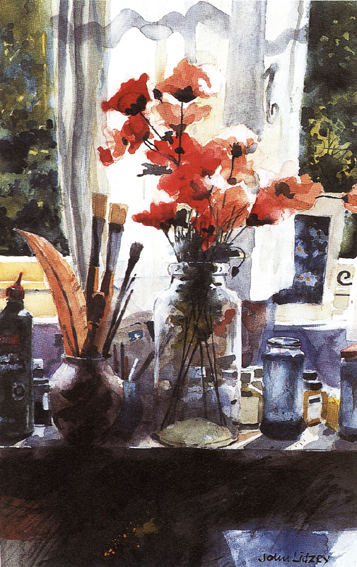
It is probably better to paint from real flowers rather than artificial ones. Although artificial flowers can be very realistic they often have a static quality that can all too easily be transferred to the painting. To overcome this problem, use a free and loose painting technique that will supply a quality of life missing in the subject, as in Studio Window in Sunlight.
Even if you choose real flowers to work from, avoid those that have a motionless elegance, which when represented in paintings can often look unexciting. It is better to select flowers that are rather more unpretentious with an interesting mixture of blossom and foliage. Wild flowers thrust roughly into a container can create a wonderful subject. But they may last for little longer than a day, so you may have to paint faster than you usually do before the subject wilts.

STUDIO WINDOW IN SUNLIGHT
watercolour, 43 × 28 cm (17 × 11 in)
The centrepiece of this studio still life is a bunch of poppies thrust into a glass jar. The flowers are artificial, yet the looseness in the way in which they were painted gives them a vitality that was missing in the subject. I allowed the colours to ‘bleed’ here and there and created a wide range of tones from pale tints to warm blacks.
Конец ознакомительного фрагмента.
Текст предоставлен ООО «ЛитРес».
Прочитайте эту книгу целиком, купив полную легальную версию на ЛитРес.
Безопасно оплатить книгу можно банковской картой Visa, MasterCard, Maestro, со счета мобильного телефона, с платежного терминала, в салоне МТС или Связной, через PayPal, WebMoney, Яндекс.Деньги, QIWI Кошелек, бонусными картами или другим удобным Вам способом.
Вы ознакомились с фрагментом книги.
Для бесплатного чтения открыта только часть текста.
Приобретайте полный текст книги у нашего партнера:
Всего 10 форматов