The Duffer’s Guide to Painting Watercolour Landscapes
Once the primaries are in place, the other colours can be slotted in between. I usually place Burnt Umber to the right of the Alizarin Crimson. This mixes with the neighbouring French Ultramarine to produce a good dark blue/grey close to black, so there is no need to buy black paint. Raw Sienna and Burnt Sienna are both useful earth colours and can be placed between Cadmium Yellow and Cadmium Red because they are both on the warm side of yellow.
Keeping colours fresh
Watercolour is a transparent medium, so white paint is not mixed with it to make it lighter. Instead, the paint is diluted with clean water to make it paler and for white areas the paper is left unpainted. So you do not need white paint.
When your blobs of paint run low, top them up with fresh paint. If the paint blobs dry out or become muddied, freshen them up with a little clean water under the tap. I usually tape or clip a second palette over mine and this keeps the palette free of dust and dirt.
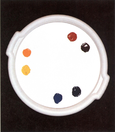
Position the three pairs of primaries first, spacing them equally around the edge. Clockwise, the colours here are Lemon Yellow, Cadmium Yellow, Cadmium Red, Alizarin Crimson, French Ultramarine and Cobalt Blue.

Placing the colours in set positions will make selecting the right colour easier. Here I have placed Raw Sienna and Burnt Sienna between the yellows and reds and Burnt Umber between Crimson and French Ultramarine.
Basic colour mixing
When beginners mix colours in a conventional palette, they usually use huge amounts of water and touch small dabs of colour into it. Not only is this wasteful, but the mixture is bound to look weak and watery. The great advantage of using a large round palette is the ample mixing area that is left in the centre. However, because there is no restraining lip between this area and the colours, you need to use less water. By pulling colours across the centre of the palette in bands – overlapping in places, keeping them separate in others – you have a choice of colours plus extra ones where they blend together and you avoid the inevitability of having a central pool of watery colour. This method also discourages you from making weak mixtures and helps you avoid insipid or muddy colours. It allows you to use stronger paint mixes, giving you more control.

When you mix colours always start by damping the brush, then pulling a little water into the centre of the palette and blending in the lighter colour first. The colours are pulled across the palette in bands. Here, Cadmium Red has been pulled into Lemon Yellow to produce orange – no surprise here. If it is too yellow more red can be added, and if it is too red more yellow can be added. If it is too dark a touch more water can be added, and if it is too weak more of each colour can be added. It is useful to practise these simple mixes.
Try some simple combinations with three primary colours to get used to mixing colours on a round palette. Each time, start with the lighter of the two colours and then add the darker. This way you will use less paint.
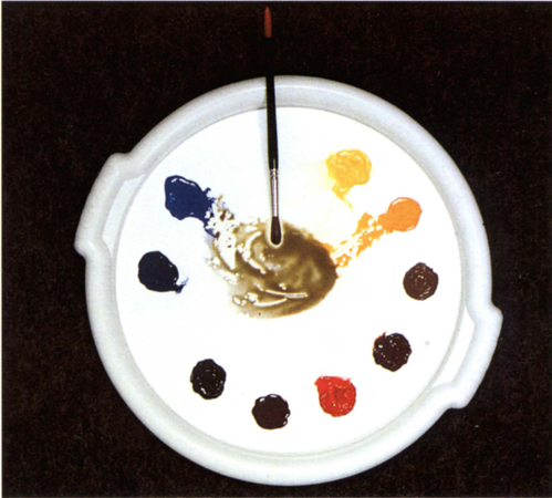
Cadmium Yellow is pulled into a little clean water, then Cobalt Blue added to make green. Of course, this is not the only green possible. By adding more of one primary than the other or adding more or less water, many shades of green can be produced just from these two colours alone. This saves buying ready-mixed greens.

Here, Cobalt Blue has been pulled into Alizarin Crimson to make violet or purple. Mixing a different blue primary into a different red primary will produce an alternative shade of violet. Experiment with your colours.
Mixing vibrant colours
There are many instances where you need pure, vivid colours and to do this we use adjacent primaries. When you mix two primaries together that are nearest to each other on the colour wheel, the result is a very intense secondary colour. Alizarin Crimson is more blue in appearance than Cadmium Red and has a leaning towards violet. French Ultramarine also leans towards violet, unlike the cooler blues, so with this affinity they make a clean-looking violet colour when mixed together.
Lemon Yellow, which is cool and greenish looking, when mixed with Cobalt Blue, produces a clear fresh green, ideal for spring foliage. Coeruleum, a very cool greenish blue, would work even better, but as this is a very powerful staining colour that is hard to lift out it is best avoided by beginners. Cadmium Red, with a leaning towards orange, mixed with the warmer of the yellows, Cadmium Yellow, produces a rich and vibrant orange. The positioning of the pairs of warm and cool primaries on the palette makes selection of these vibrant mixes simple.
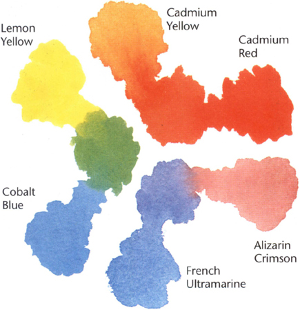
Mixing adjacent primaries produces the most vibrant secondary colours.
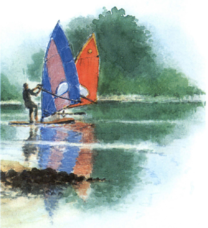
BOARD SAILING
15 × 13 cm (6 × 5 in)
Using pairs of adjacent primaries mixed together results in the essential vivid colours needed to portray the sails. The strong green colours of the background trees make the sails stand out even more.
Avoiding muddy colours
If you add three primaries together in roughly equal quantities the result is grey or ‘mud’ and this can happen very easily without you being aware of it.
For example, you may have mixed yellow and red and finished using the orange that resulted. If some of the remnants of this are inadvertently left on the palette (or you have not cleaned your brush properly) you will find when you mix the red with blue to make a pleasant violet, for instance, that the result is often very drab. The reason is that some of the previous mixture blends with the new mixture. As the orange residue contains yellow, when added to your two new colours, red and blue, the result is a blend of all three primaries again. So, to avoid this, clean the mixing area often or keep different colour mixes on separate sides of the palette and clean your brushes properly in between mixes.
Neutralizing colours
Just as vibrant hues can be mixed from two adjacent primaries, so a neutral hue can be produced from mixing two primary colours that are not adjacent on the colour wheel. In fact, the further apart they are, the more neutral or dull they become because the colours ‘lean’ in the wrong direction.
Mixing just two primaries together is slightly limiting and may not produce the subtle hue you need, so what about mixing three together to produce neutral tints? This seems to contradict the advice I have just given you: it is true that mixing equal amounts of the three primary colours produces a very dull grey or muddy mixture. The important point is to add just a tiny amount of the third primary to produce a neutral hue. To tone down a single primary, just add tiny amounts of the other two primaries.
The beauty of arranging your colours on a round palette to match the colour wheel is that complementary colours, whether mixtures or individual colours, are always roughly opposite each other, so you know where they are without having to think about it.
Конец ознакомительного фрагмента.
Текст предоставлен ООО «ЛитРес».
Прочитайте эту книгу целиком, купив полную легальную версию на ЛитРес.
Безопасно оплатить книгу можно банковской картой Visa, MasterCard, Maestro, со счета мобильного телефона, с платежного терминала, в салоне МТС или Связной, через PayPal, WebMoney, Яндекс.Деньги, QIWI Кошелек, бонусными картами или другим удобным Вам способом.
Вы ознакомились с фрагментом книги.
Для бесплатного чтения открыта только часть текста.
Приобретайте полный текст книги у нашего партнера:
Полная версия книги
